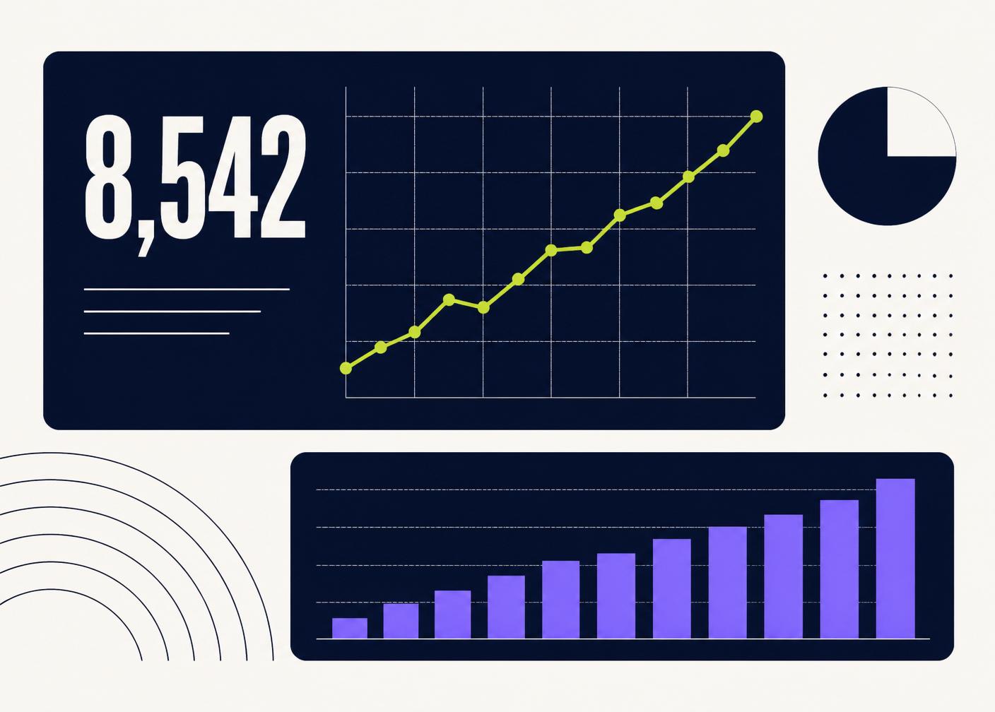
A dashboard is not a wall of charts. It is a small, deliberate answer to the question "how are we doing right now?" The dashboards that survive are the ones that answer that question in under ten seconds.
Start with the decision, not the data
Ask what the person opening the dashboard is trying to decide. "Do I need to intervene today?" leads to a very different layout than "how did last quarter go?" Every metric you show should support one specific decision.
If a chart does not change any behaviour, it does not belong on the dashboard.
The top-left rule
Eyes land in the top-left. Put the single most important number there — big, unambiguous, with a comparison next to it (vs. last week, vs. target). Everything else supports that number.
Three zones, not thirty tiles
A useful dashboard usually has three zones:
- Headline — the one number and its trend
- Drivers — the three or four inputs that move the headline
- Detail — a small table for the person who wants to dig in
Anything more and the eye stops knowing where to look.
Design for calm
Consistent number formats. Muted colors with one accent for attention. White space between zones. A single font. A "last updated" timestamp in the corner so no one has to ask.
The dashboards teams love feel quiet. The ones they ignore feel loud.
Make it obvious what to do next
If a metric goes red, what should happen? Write it directly on the dashboard. "If pipeline dips below 40, review outbound." Removing the guesswork is what turns a dashboard from a report into a tool.
Ship version one, then listen
Send the first version to two people. Watch which numbers they screenshot and share. Those are the ones that matter. Cut everything else. A great dashboard is almost always smaller than the first draft.
Have a workflow that should work better?
Tell us what is manual, repetitive, or difficult to manage. We’ll look at what a better system could look like.
Book a free call